
What’s included in a website maintenance retainer? (UK, 2026)
28th May 2026
Last updated: 22nd May 2026

A school’s website is the first conversation you have with most prospective families. Before they tour the building, meet the headteacher, or read your Ofsted report, they land on your homepage—and what they find there shapes their decision more than any open day.
For existing parents and staff, it’s something different: a daily working tool. Term dates, parents’ evening bookings, policy lookups, sickness reporting, newsletters. Get it wrong and you create dozens of phone calls a week the office didn’t need to take.
The ten features below are the ones that consistently separate the school websites that work from the ones that frustrate everyone who touches them. Some are obvious. A few are easy to overlook—until the complaints start arriving.

Mobile traffic to UK school websites typically sits somewhere between 60% and 75% of all sessions. If your site renders poorly on a phone, you’re failing the majority of your audience—and yet many of the schools that approach us still arrive with sites built for desktop and patched for mobile as an afterthought.
Responsive design isn’t a feature you add to a site. It’s how the site is built from the start. A responsive layout reshapes itself for the screen it’s loaded on: full-width navigation on desktop, a tap-to-open menu on mobile, images that scale rather than overflow, text that stays readable without pinching.
Google now indexes the mobile version of your site by default, not the desktop one. If your current site needs zooming to read on a phone, your search rankings have probably already suffered for it—and prospective parents have moved on before they finished the first paragraph.
We design every school website mobile-first at Parrot Creative, sketching the phone view before the desktop view. It’s the only reliable way to make sure the most-used version of your site is also the best one.
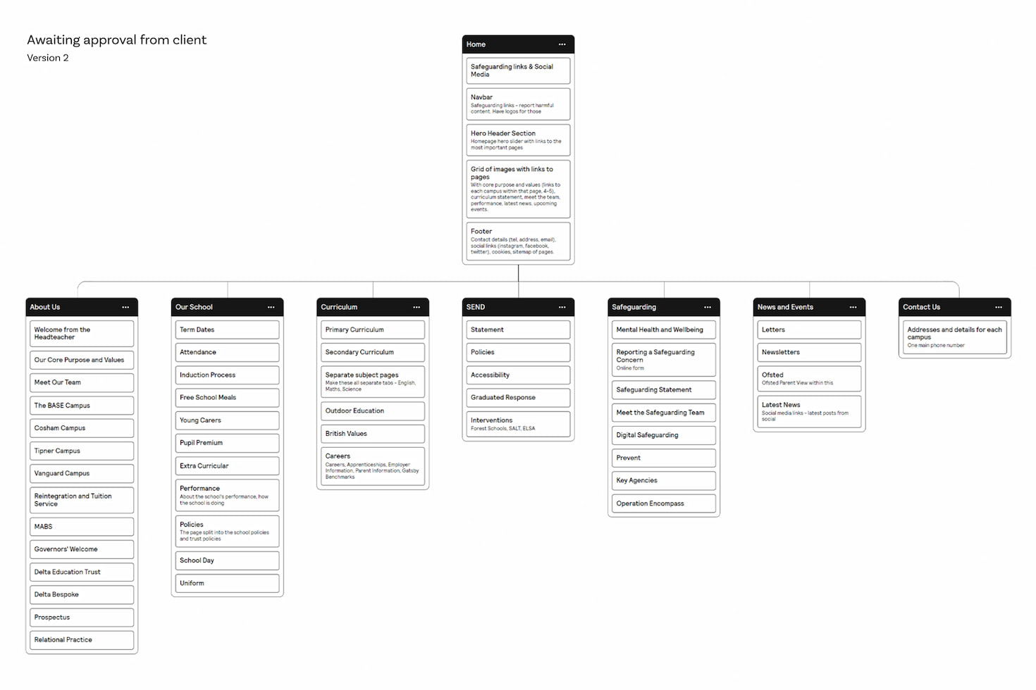
A school’s main menu has more to do than almost any other site’s. It has to surface admissions information for prospective families, term dates for current parents, policies for inspectors, and contacts for everyone. Cram all of that into a single bar without thinking and the menu becomes useless to all of them.
A workable structure usually starts with grouping by audience: a “Parents” area for the people who already chose you, an “Admissions” area for those still deciding, and an “About” area for everyone else. Within each, labels should match the words people actually search for. “Term Dates” beats “Academic Calendar”. “Contact” beats “Get in Touch”.
Add a visible search bar. Most school websites have one buried in a footer or hidden behind an icon, but search is how parents find the things you forgot to add to the menu. If your search returns nothing for “uniform” or “lunch menu”, fix that before you do anything else.
Breadcrumbs help on large sites with deep page hierarchies. Drop-downs help if you keep them shallow. Mega-menus help on big secondary school sites with departments and key stages. Pick the pattern that fits your structure rather than copying one that fits another school’s.
A useful test: ask three parents to find your behaviour policy without using the search bar. If any of them gives up, your navigation needs work.
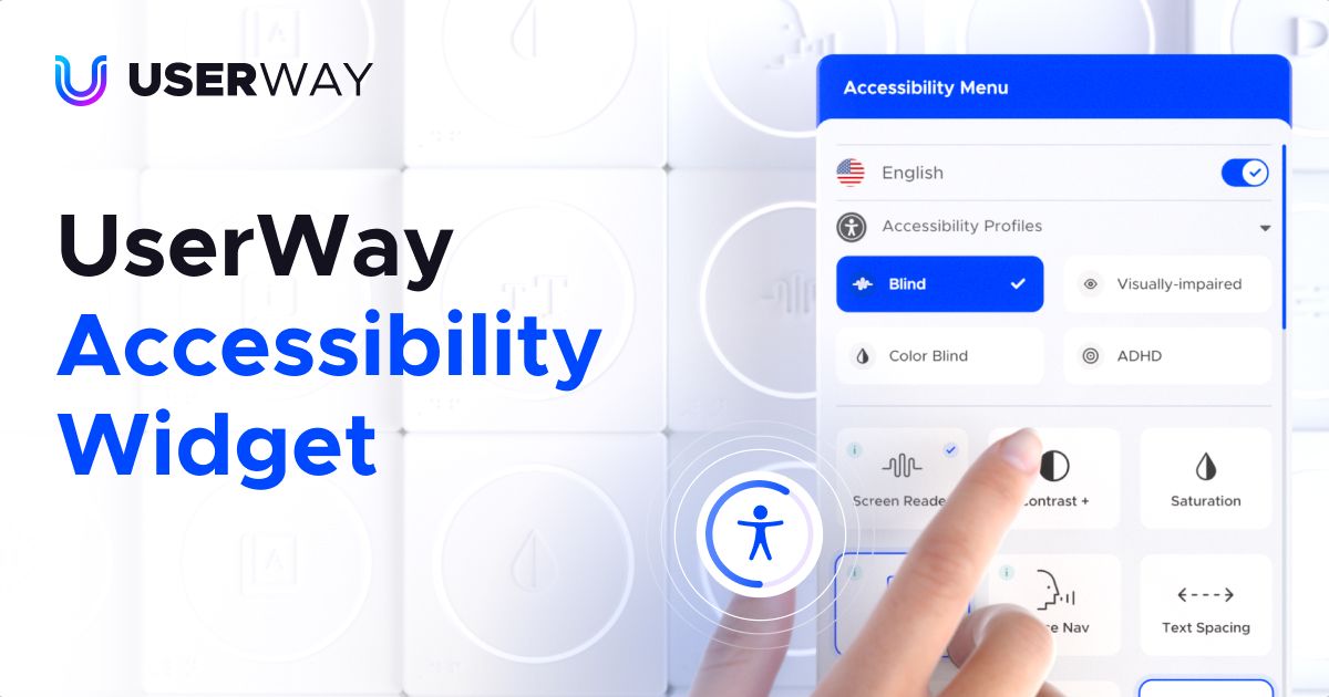
The UK has had legally binding accessibility requirements for school websites since the Public Sector Bodies (Websites and Mobile Applications) Accessibility Regulations came into force in 2018. Most maintained schools and academies fall under them. The required standard is the Web Content Accessibility Guidelines (WCAG) 2.2 Level AA—updated from 2.1 in October 2023, and many schools still haven’t caught up.
Genuine accessibility is structural, not a widget you bolt on. It means heading hierarchies that screen readers can navigate, alt text on images that conveys meaning rather than just decoration, link text that makes sense out of context (“download our admissions form” rather than “click here”), form fields with proper labels, and colour contrast that meets the minimum ratios.
A good accessibility widget—UserWay or similar—can layer on top of that and let users adjust text size, contrast, spacing, or run text-to-speech. It’s a useful aid for the people who need it. What it cannot do is fix a website that wasn’t built with accessibility in mind underneath.
Schools serving neurodiverse pupils or families with English as an additional language often need to go further. When we built The Wymering School, a special free school in Hampshire, we layered Google Translate and the UserWay widget on top of a structure that was already accessible from the ground up. The two work together; neither works on its own.
WCAG isn’t just an ethical floor; it’s a legal one. Sites that fail it can be reported to the Equality and Human Rights Commission, and parents have grown more willing to do so in recent years.
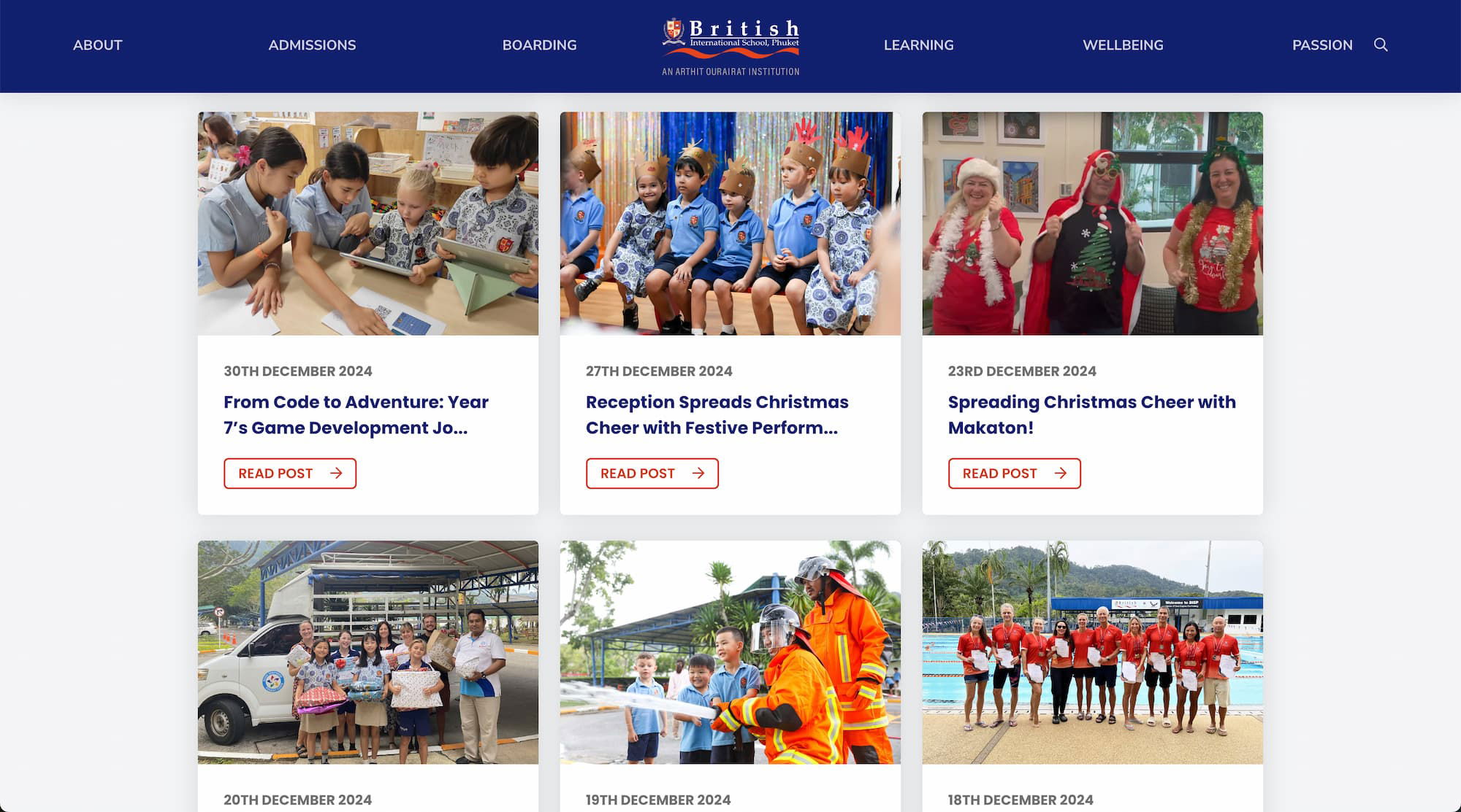
A regularly updated news section does two jobs at once. For current parents it’s a communication channel. For prospective ones, it’s evidence the school is active—that things actually happen here, that the website isn’t a relic.
An empty news feed is worse than no news feed. If the last post is from a sports day two years ago, you’ve actively damaged the impression you make. A page like that says: nothing happens here, or whoever’s meant to update the site has given up.
Realistically, most schools don’t have the bandwidth for a weekly blog. There are two ways round it. The first is to lower the bar—short posts about a class trip, a charity bake sale, a Year 11 maths competition. They take fifteen minutes to write and they keep the page alive. The second is to plug in a social feed: many schools already post on Facebook or Instagram regularly, and a feed widget pulls those posts onto the website automatically. One post, two homes.
Whichever route you go, categorisation and tags make the page more useful over time. A parent looking for “Year 7 news” should be able to filter to it without scrolling through everything else.
Schools like British International School, Phuket keep genuine momentum on their news section because writing is built into the staff routine, not a job dumped on whoever has a free afternoon. The website is only as alive as the people feeding it.
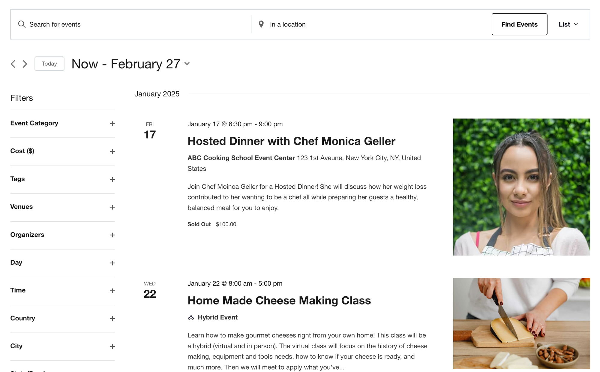
A school year has a lot of dates. Term times, INSET days, parents’ evenings, sports fixtures, school plays, parent coffee mornings, exam weeks, residential trips. Put them all on a single calendar and you save the office a steady stream of “what date is X?” emails.
The calendar should be browsable in different views—month grid for the big picture, list view for the next two weeks, day view for one-off lookups. Each event needs to be a real page or popup, not just a label on a square: parents want to know start time, location, what to bring, who it’s for.
Colour-coding by event type (academic, sport, performance, admissions) lets people scan visually. Filters let parents hide what isn’t relevant—a Year 3 family doesn’t need to wade through Sixth Form open evenings.
The single most useful feature, and the one most often missed: a “Subscribe to calendar” button that adds the school’s events to a parent’s own Google or Apple calendar. They get reminders for free. They don’t need to remember to check your site.
If your events calendar still requires the office to email out a PDF of term dates every August, you’re doing twice the work for half the result.

A staff directory humanises the school. Names, roles, and ideally a photo make it easier for parents to put a face to a name when they walk through the door. For prospective families it’s a quick way to gauge the breadth and seniority of the team without trawling through job titles in policy documents.
How much information you publish is a judgement call. Most schools include names, roles, and a contact route. Some add qualifications, year groups taught, and a short bio. Some include photos with consent; some don’t. Larger schools usually group by department; smaller ones list by leadership tier.
Don’t publish personal email addresses. Use a contact form, a generic role-based address (head@), or the school office address. Personal addresses scraped from school websites end up in spam lists within weeks—and they’re a phishing risk you don’t need.
A staff page with photos and one-paragraph bios outperforms a stark list of names every time we’ve seen it tested. It takes longer to set up. It’s worth it.
Portals are where the school website stops being a brochure and starts being software. Behind a login, parents see their child’s attendance, grades, behaviour log, and outstanding fees. Students see their timetable, homework, and learning resources. Staff see whichever subsets they need.
Most UK schools don’t build portals from scratch. They integrate with established MIS platforms like Arbor, Bromcom, SIMS, or ScholarPack. The school website’s job is to be the front door: a single sign-on, a clear path in, and a sensible fallback for the parent who has forgotten their password at 8:47am on a Monday.
Security is non-negotiable here. Role-based access (a parent sees their child’s record, not another family’s). Encrypted connections. Strong password requirements. Two-factor authentication for staff. Audit logging so that breaches can be investigated. And UK GDPR compliance baked in—children’s data carries the strictest protections in UK law.
A portal is only as secure as the website wrapped around it. If the WordPress install hasn’t been updated in eighteen months, the portal sitting behind it isn’t really protected. Ongoing WordPress maintenance and support—security patches, plugin updates, monitoring, backups—is the unglamorous half of running a school site safely.
GDPR fines aren’t theoretical. The ICO has issued penalties to schools and trusts for data breaches involving pupil information. A login screen with no two-factor option in 2026 is a problem waiting to happen.

The school office can’t reasonably be the bottleneck for every routine request. Online forms—for admissions enquiries, trip consent, free school meal applications, parent feedback, club sign-ups—move that work onto the parent’s phone and off the office desk.
A good online form does three things a paper one can’t. It validates (no missed fields, no illegible handwriting). It routes (admissions enquiries go to admissions, SEN forms go to the SENCO, complaints go where they’re meant to go). And it stores everything in a searchable system rather than a filing cabinet.
Useful features to look for: conditional logic (only show “child’s medical conditions” if the parent ticks yes to a previous question), file uploads (for birth certificates, proof of address), integrated payments via Stripe or GoCardless for trip fees and uniform purchases, and signature capture for consents.
Mobile is where most of these forms will be filled in. If your form requires pinch-to-zoom on a phone, parents will start it and not finish.
One school we worked with replaced a paper trip-consent process with a single online form and stopped chasing thirty-plus missing returns per trip. The form took only an hour to build. That’s the kind of return the office can actually feel.

Photos and video do something words can’t. They show the school as it actually feels: classrooms mid-lesson, the cross-country team after a wet Saturday fixture, the Year 6 production, the science fair. Prospective families absorb more from thirty seconds of footage than from three pages of prose.
Group images into categories that match how parents think about school life—events, sport, arts, trips, day-to-day teaching. Don’t dump every photo into one long scroll; nobody makes it past the first screen. A drone shot or a short walkthrough video of the site is unusually high-value for international or distant prospects who can’t easily visit.
Photo consent matters. Keep a clear opt-in process with parents, refresh it annually, and have a removal path that’s quick when someone asks. The technical side is straightforward; the safeguarding side is what schools tend to get wrong.
Galleries also need to be light. Twenty unoptimised photos at 8MB each will crater your page speed and your Core Web Vitals scores, which feeds straight back into your Google rankings. Decent website hosting and proper image compression do a lot of quiet work here.
A short, well-shot video tour of the school is one of the highest-converting pieces of content a prospective parent will ever see. Phone-shot is fine. Honest beats polished.

A school website that nobody can find isn’t pulling its weight. Search Engine Optimisation (SEO) is the work that puts your site in front of parents when they search “primary schools near me”, “[your town] secondary school open day”, or “[your school name] term dates”. Some of those parents already know who you are. Some are deciding between you and the school down the road.
Local SEO is the foundation. Make sure your school has a complete Google Business Profile with current opening hours, photos, and the correct address. Get listed on Get Information About Schools (GIAS) and your local authority directory with consistent name, address, and phone details across all of them.
On the site itself, the basics still do most of the heavy lifting: clear page titles, useful meta descriptions, headings that actually describe the page, fast loading times, and content that answers the questions parents are typing into Google. A page called “Term Dates 2026-27” with the actual dates on it will outperform a glossy “Academic Calendar” page that hides the information behind a PDF download.
Content compounds over time. A page that explains your admissions process clearly. A blog post about how you teach phonics. A genuinely informative page about SEN provision. These rank, they build trust, and they keep working long after they’re published.
AI-generated search summaries—Google’s AI Overviews, ChatGPT Search, Perplexity—increasingly pull facts directly from school websites to answer parent queries. If your information isn’t accurate, structured, and clearly written, the AI will quote whichever school’s is.
A school website isn’t a one-off project. It’s a piece of infrastructure that has to keep working for years—through staff changes, policy updates, new statutory requirements, and a steady inbox of parent feedback. The features above are what make that infrastructure useful instead of frustrating.
At Parrot Creative we’ve designed websites for primary schools, secondary schools, special schools, and international schools across the UK and abroad. We know what slows them down (usually the CMS), what gets them complaints (usually navigation), and what wins them admissions enquiries (usually a clear, fast, honest site that loads on a phone).
If your current site is closer to the second list than the first, get in touch. We’ll take a look and tell you what we’d do, with no obligation.
Related Posts